Project overview
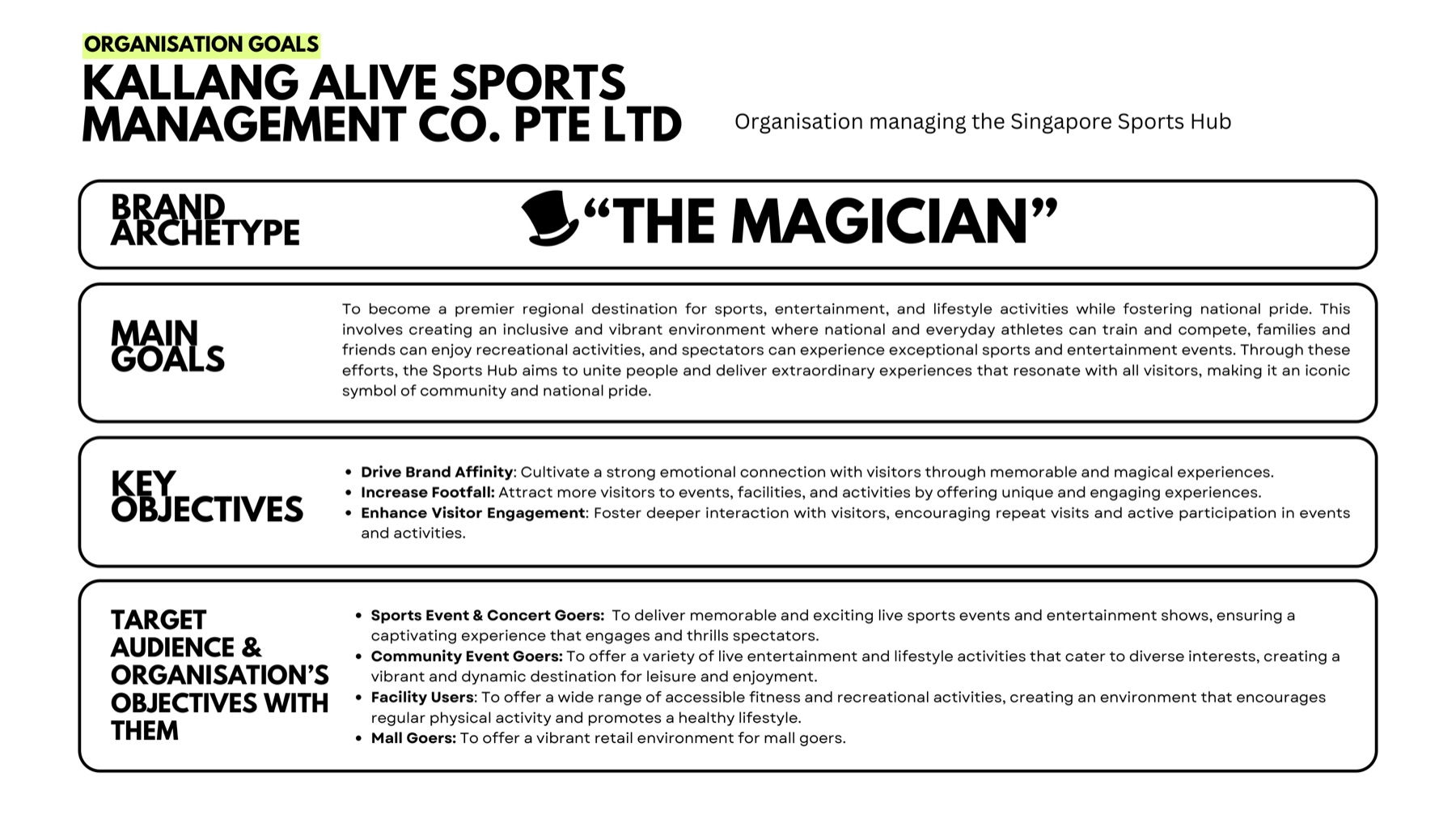
Singapore Sports Hub serves several overlapping audiences, including sports and concert attendees, community-event visitors, facility users and people visiting the surrounding retail and lifestyle destination.
The project began with an individual evaluation of the existing website and progressed into a collaborative high-fidelity redesign. The goal was not simply to modernise the interface, but to make key visitor journeys clearer and more coherent.
- Scope
- Website evaluation and redesign
- Deliverables
- UX analysis, persona, recommendations, high-fidelity prototype and usability test
- Platform
- Responsive website
- Context
- Individual research followed by a six-person team project
The evaluation, persona and recommendations were my individual work. The high-fidelity prototype and usability test were produced with a six-person team.
A visually rich website with competing user priorities
The website contained substantial information about facilities, events, activities, dining and visitor services. While this breadth supported many audience needs, it also created competition for attention. Users needed a clearer route from initial discovery to practical actions such as viewing event details, purchasing tickets and planning a visit.
What the evaluation found
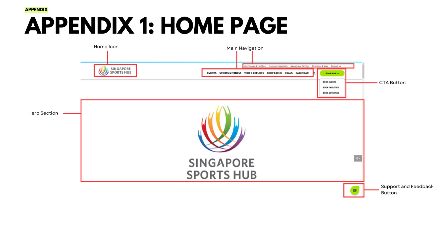
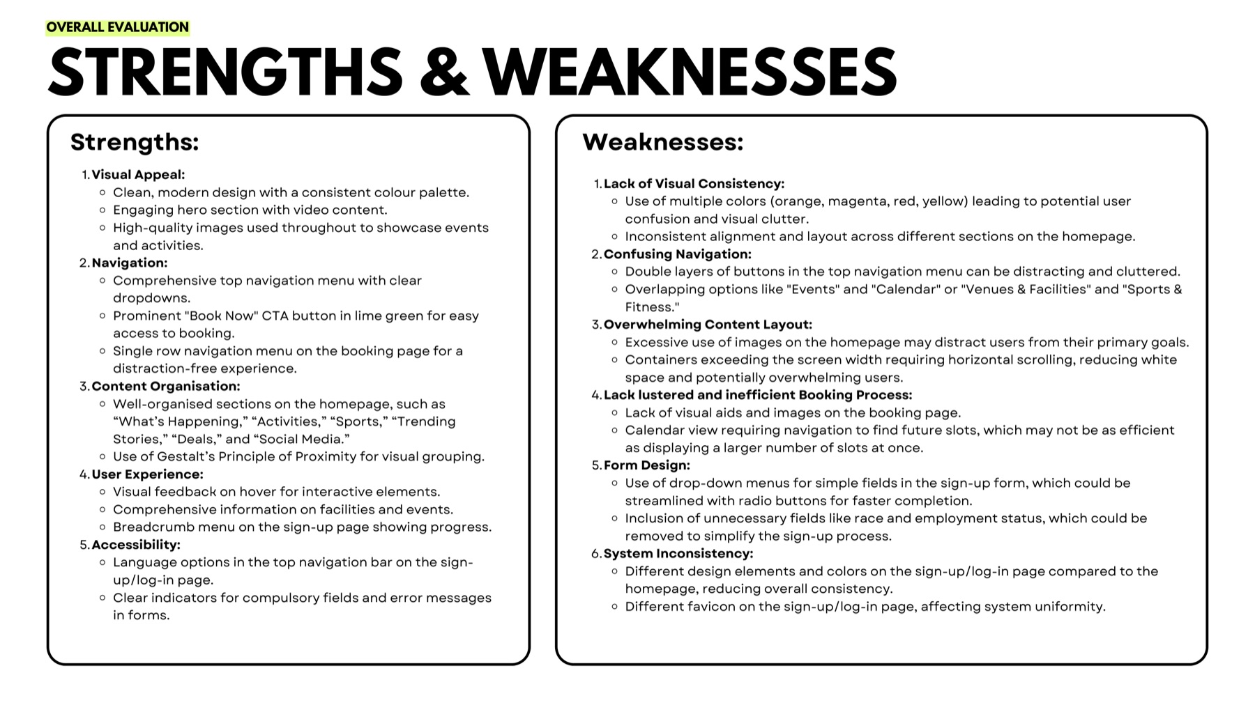
- The video-led hero attracted attention but did not communicate a sufficiently clear value proposition.
- A large number of images and content modules could distract visitors from their primary goals.
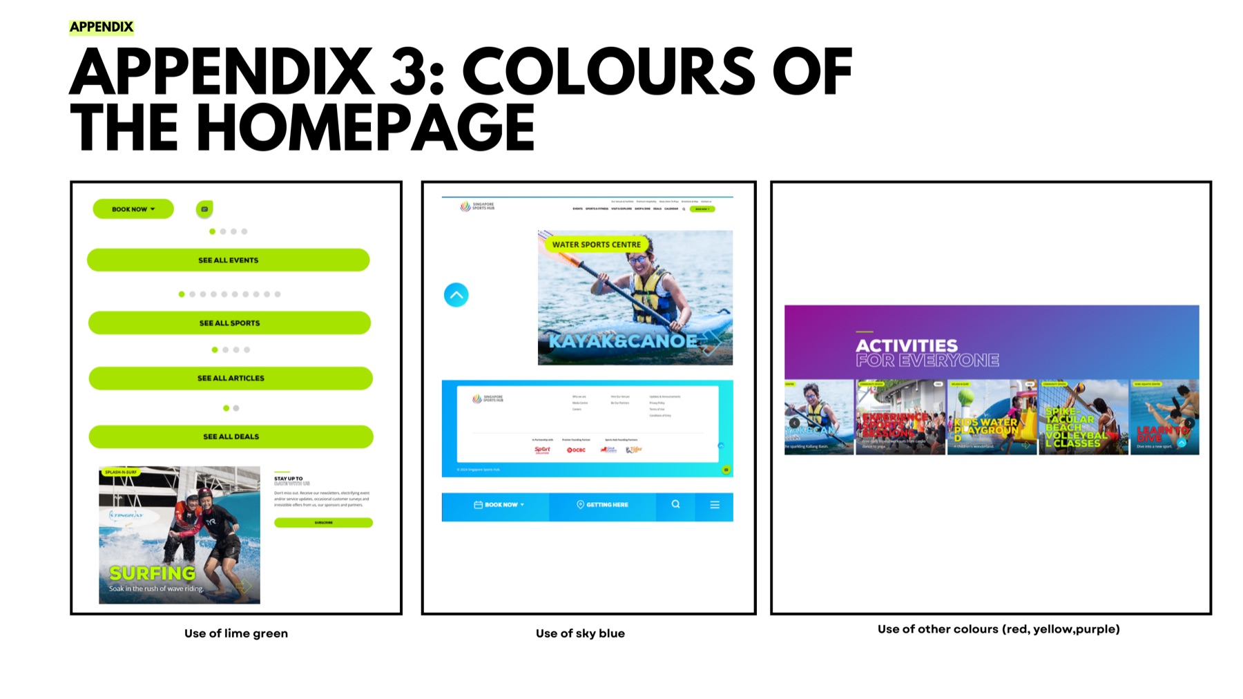
- Lime green effectively highlighted important actions, but the broader use of several strong colours weakened visual consistency.
- Navigation covered many activities and visitor needs, increasing the importance of clear grouping and hierarchy.
Users and objectives
The website has to hold four broad audience groups at once, each arriving with a different intention.
- Sports-event and concert attendees
- Community-event attendees
- Facility users
- Visitors interested in retail, dining and leisure
Primary product goals
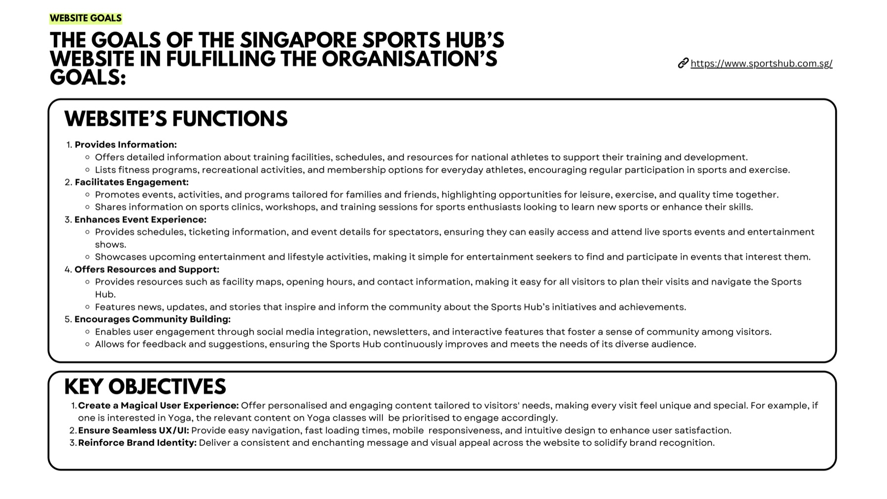
- Help users discover relevant events and activities
- Make navigation and visit planning straightforward
- Provide clear ticketing, scheduling and venue information
- Strengthen visitor engagement and repeat usage
- Maintain a recognisable Singapore Sports Hub identity
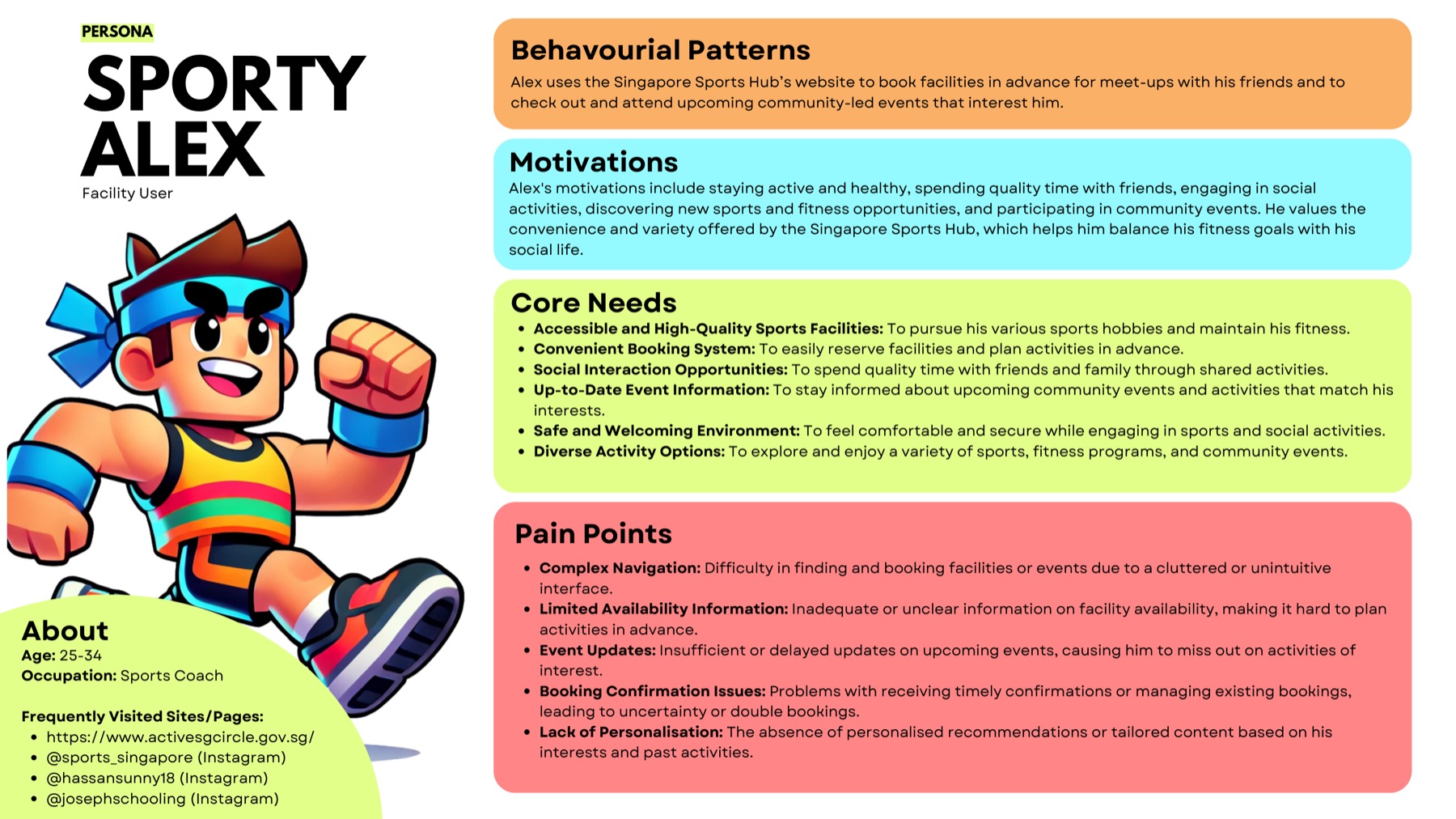
The persona “Sporty Alex” was developed to keep the evaluation anchored to a specific set of motivations and frustrations rather than to abstract audience labels.
Research and evaluation
The first phase was a structured evaluation of the existing product rather than a field study. It combined the following activities:
- Organisational and audience analysis
- Website-goal analysis
- Persona development
- Interface evaluation
- UX and visual-hierarchy assessment
- Review of navigation, content presentation and calls to action
This phase was desk-based analysis and expert evaluation. It was not ethnographic research, and no large-scale user study was conducted at this stage.
Key insights
Attention did not always equal clarity
The visual hero was engaging, but users still needed a stronger explanation of what they could do on the website.
Breadth required better prioritisation
The number of facilities, events and visitor services made hierarchy and information architecture critical.
Colour needed a clearer system
Strong accent colours could guide action, but too many competing colours reduced consistency.
Event journeys deserved priority
Discovering an event, reviewing details and purchasing a ticket represented a high-value end-to-end journey.
Turning the website into a clearer event-discovery experience
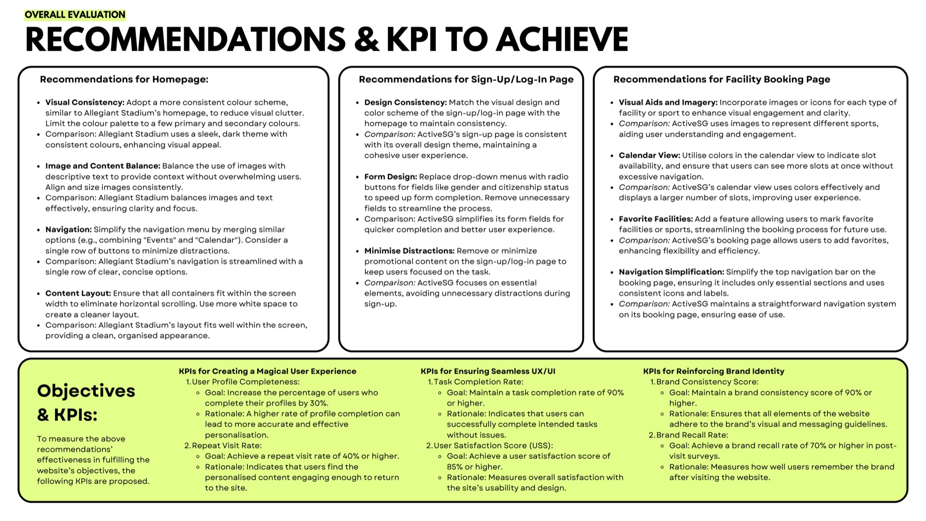
The redesign direction concentrated on the discovery-to-action journey, and on giving each prominent element on the page a job to do.
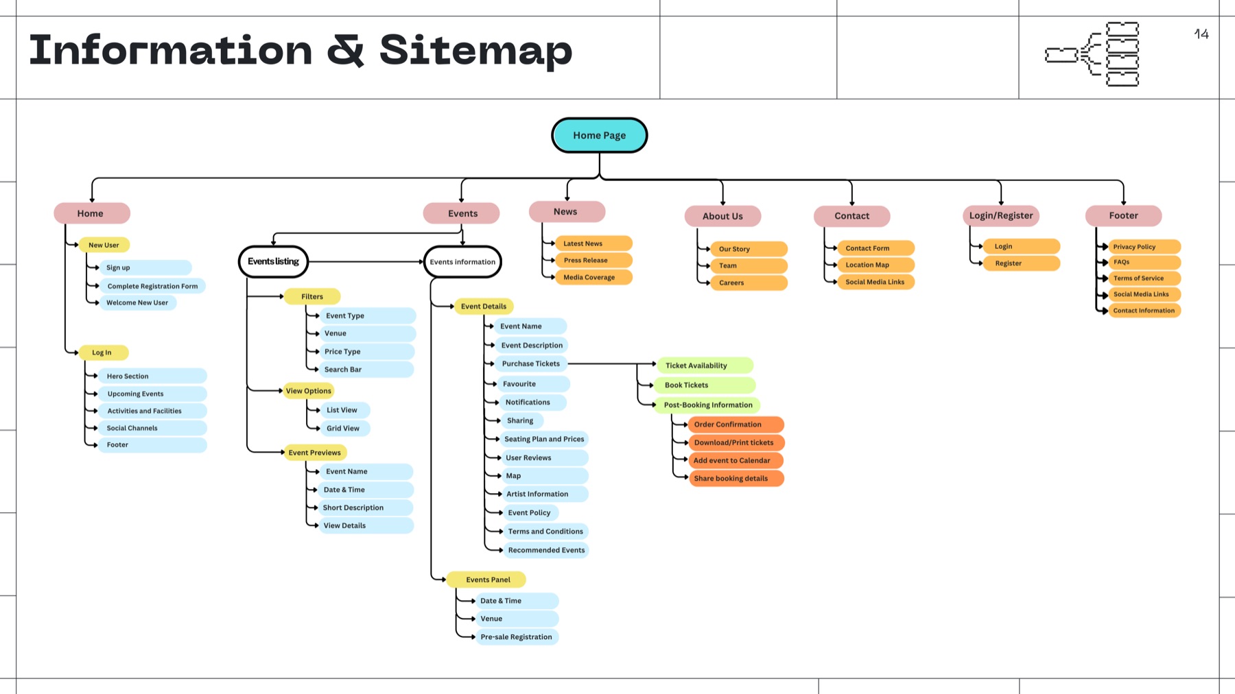
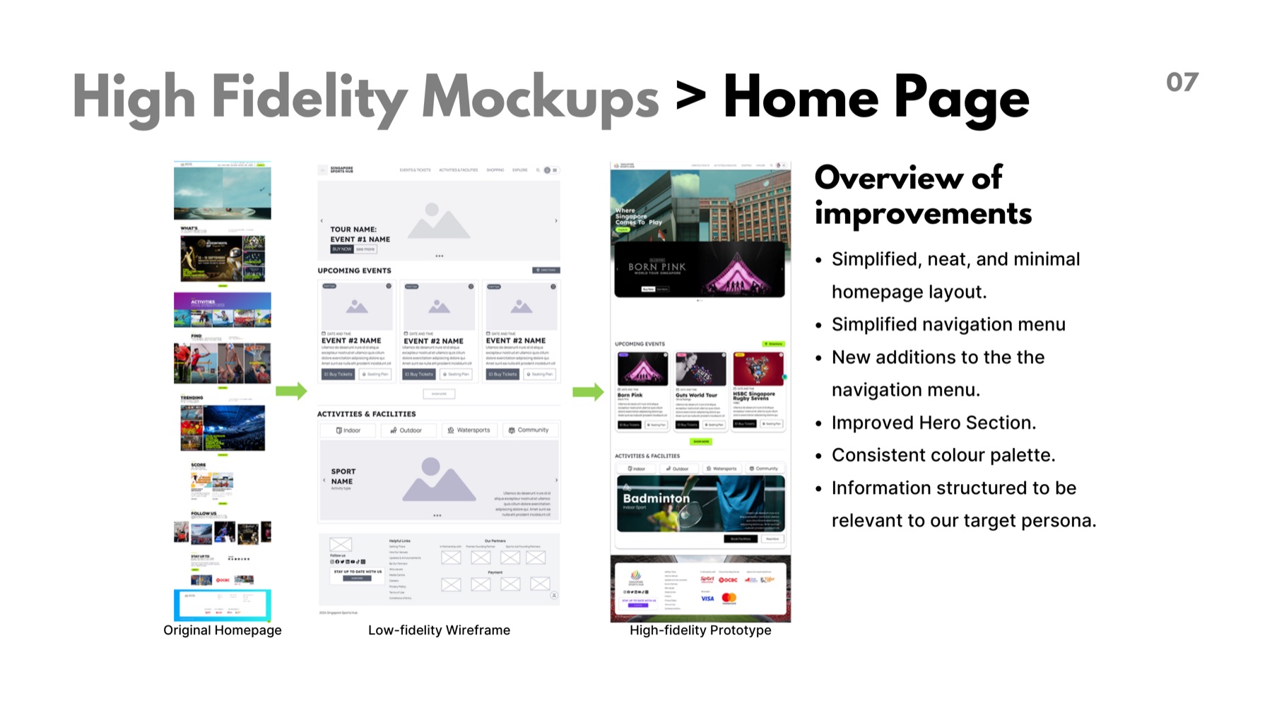
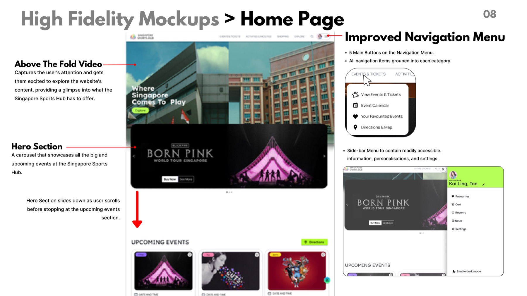
- Reduce the primary navigation to five clearer categories
- Group related navigation items more deliberately
- Add a sidebar for personalisation, information and settings
- Use an attention-grabbing above-the-fold video more purposefully
- Surface major upcoming events through a prominent carousel
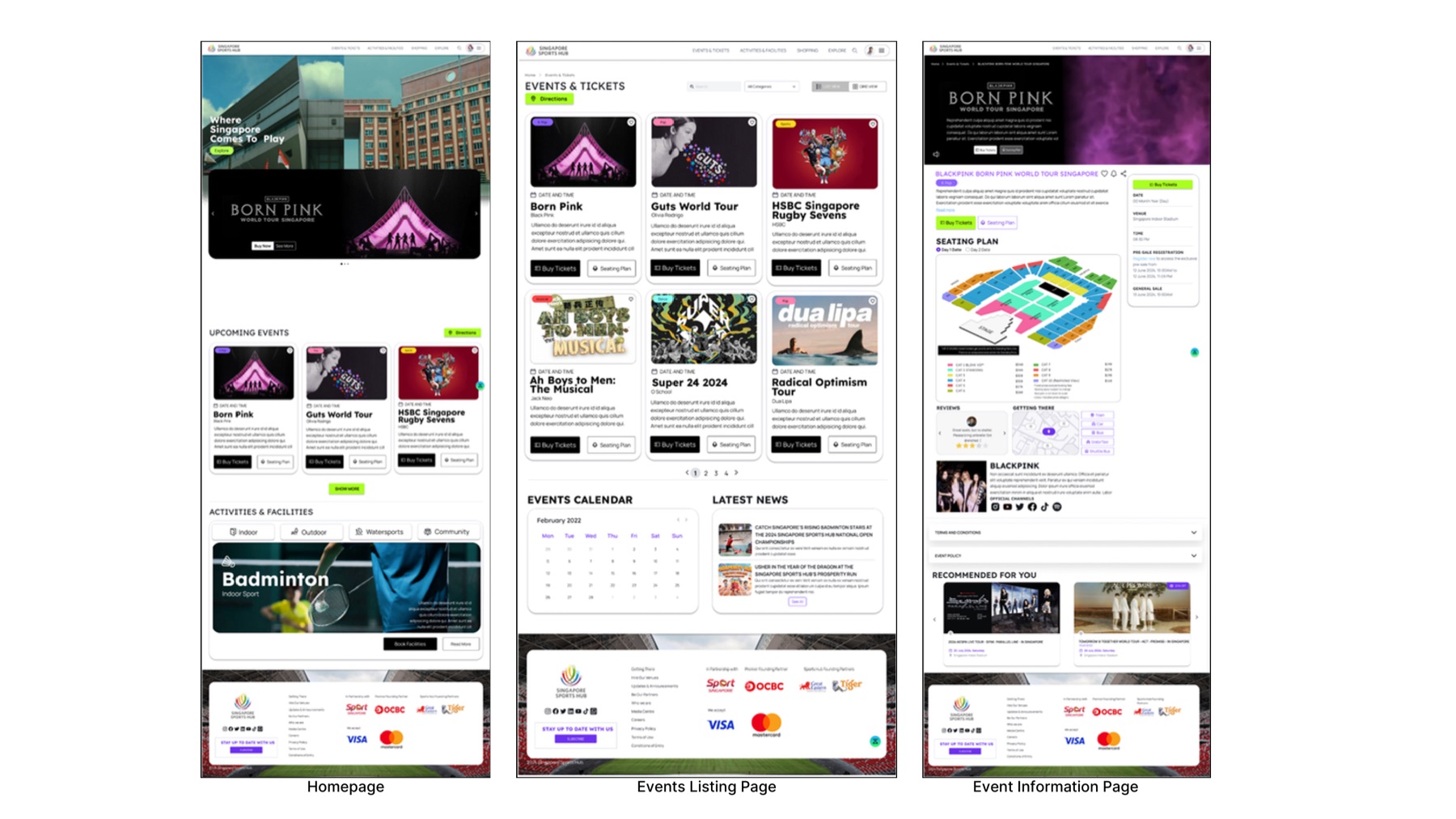
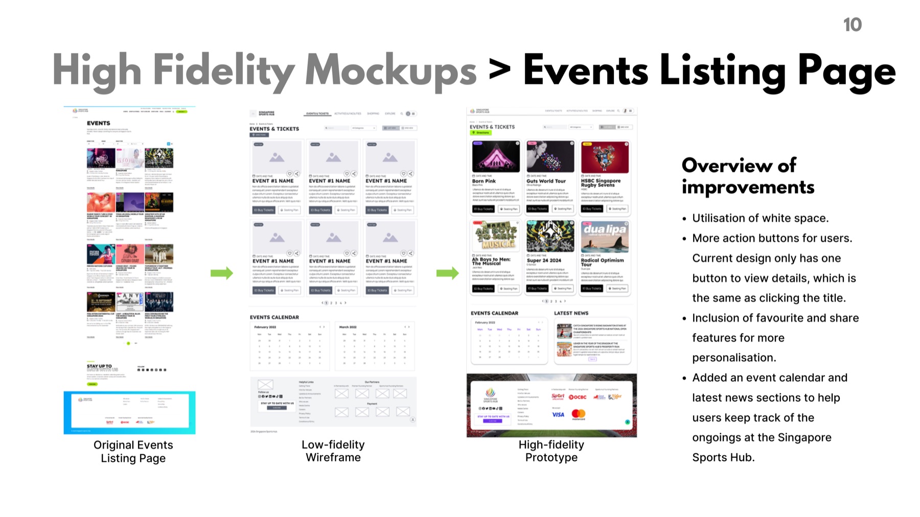
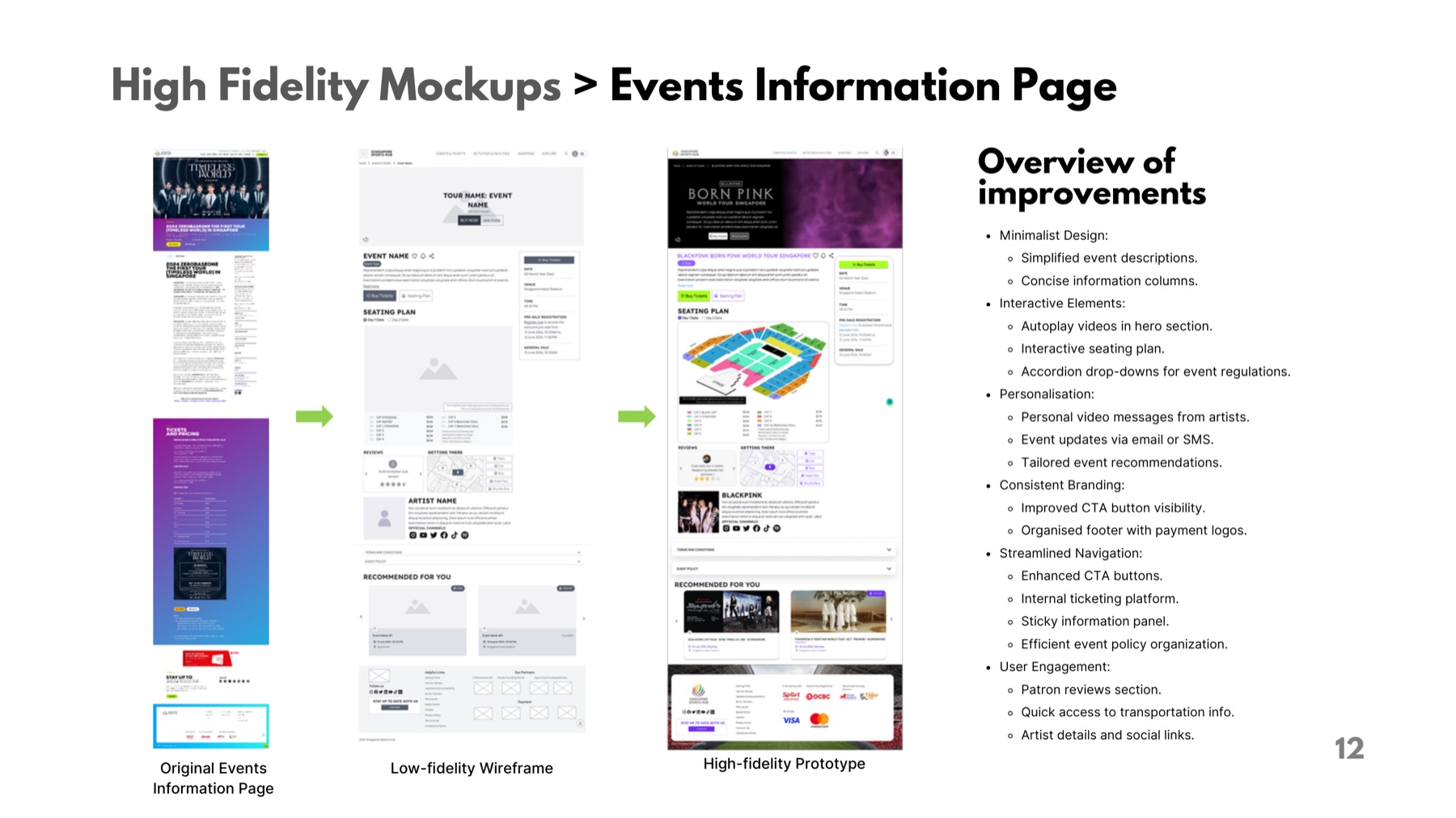
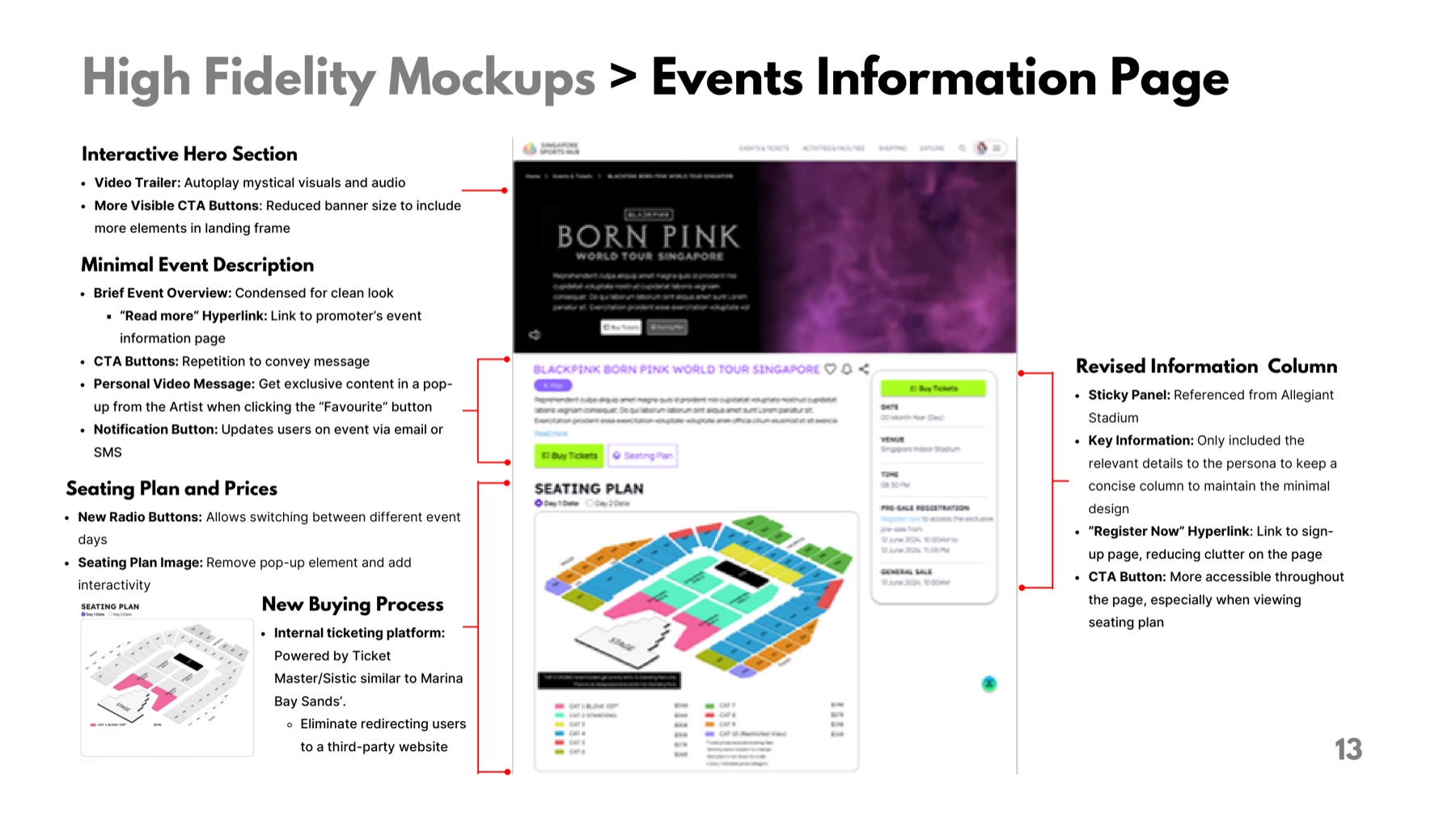
- Create clearer event-listing and event-information pages
- Improve access to ticketing, event notifications and practical venue information
Every prominent interface element should help a visitor discover, understand or act.
Prototype and interaction design
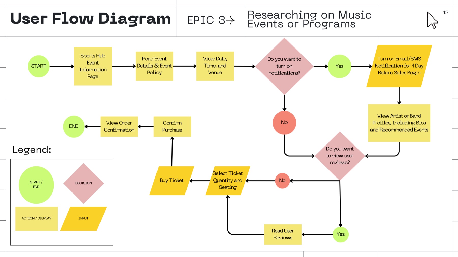
The team built a high-fidelity prototype so the direction could be tested as a journey rather than reviewed as static screens. It covered:
- A reorganised homepage
- Improved top-level navigation
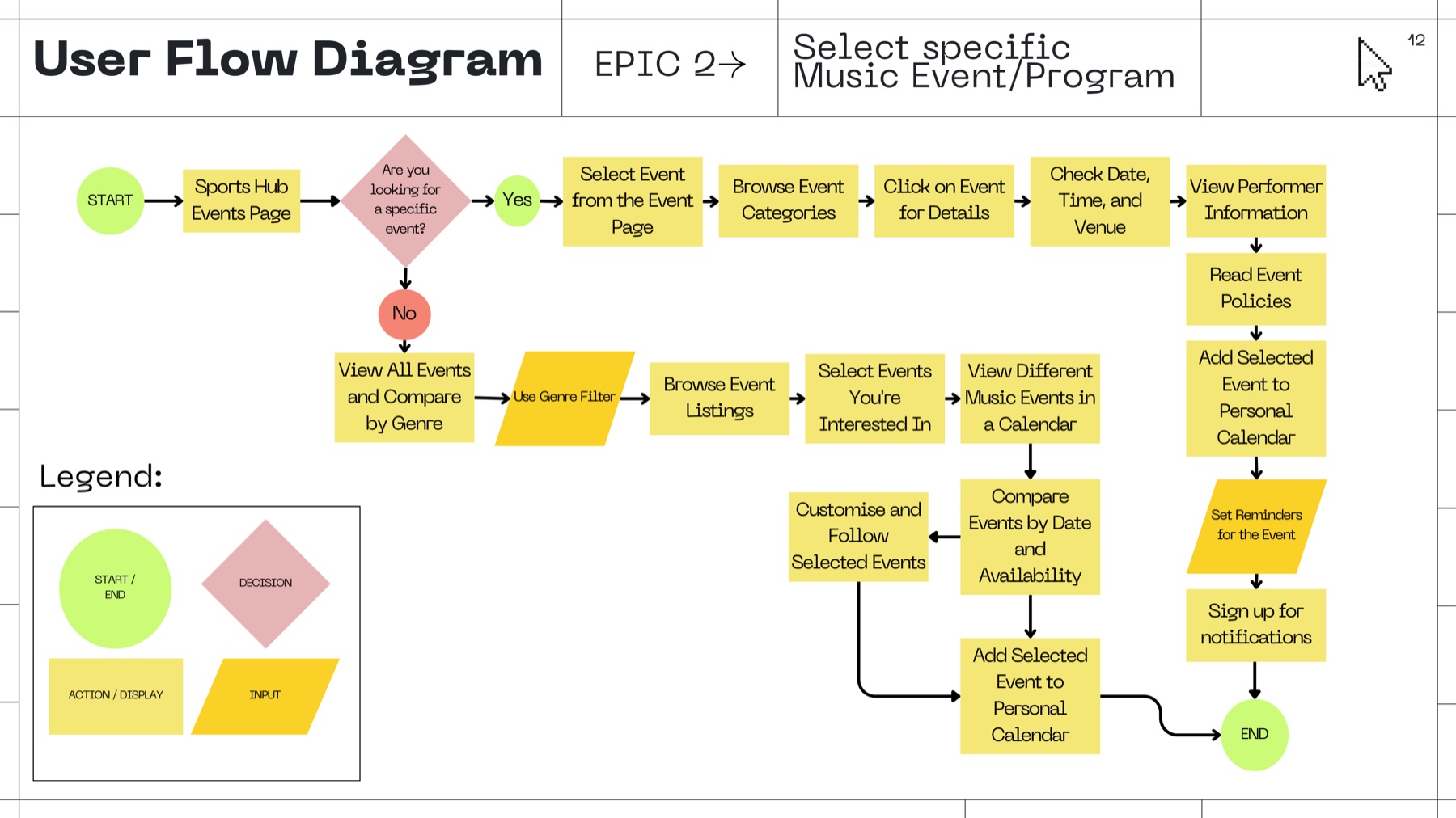
- Upcoming-event discovery
- Event listing and filtering
- Detailed event information
- Ticket-purchase calls to action
- Event-sale notifications
- Seating and venue information
Usability testing
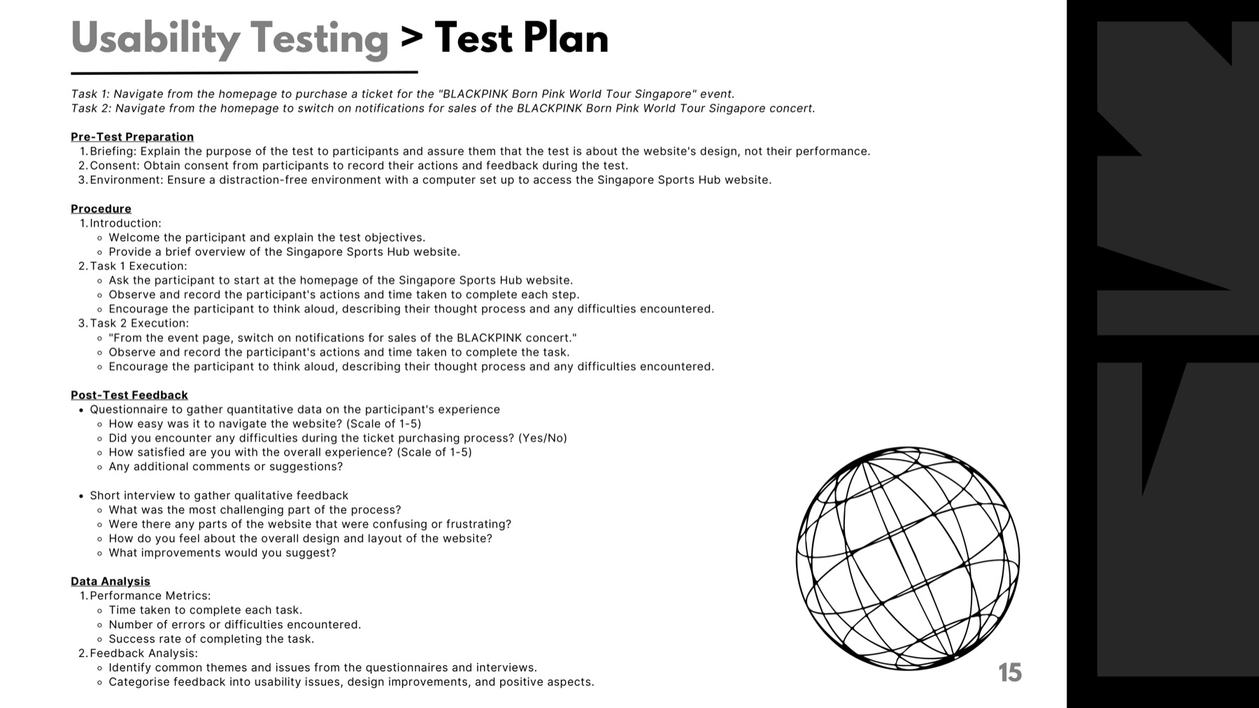
The prototype was evaluated with task-based usability testing. Participants were asked to complete two journeys that represented the highest-value path through the product.
Task 1
Navigate from the homepage to purchase a ticket for the BLACKPINK Born Pink World Tour Singapore event.
Task 2
From the event page, activate notifications for ticket sales.
What the evaluation considered
- Task completion
- Time taken
- Errors and hesitation
- Navigation ease
- Overall satisfaction
- Think-aloud feedback
- Post-task qualitative comments
Numerical results are not shown here: the underlying figures are not recorded in this write-up, and the sample was not large enough to generalise from.
Findings and iteration
What held up
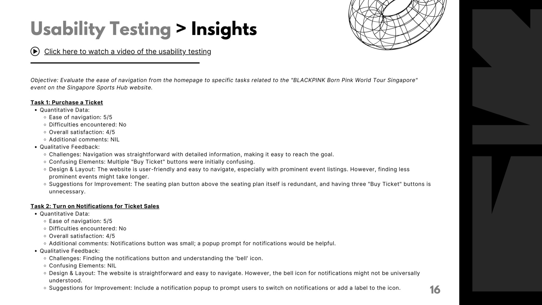
- Users generally found the structure easy to navigate.
- Prominently featured events supported quick discovery.
- Detailed event information was appreciated.
What did not
- Multiple “Buy Ticket” buttons caused hesitation.
- A seating-plan button positioned immediately above the seating plan felt redundant.
- The notification bell was not immediately understood.
- Less prominent events still needed consistent routes for discovery.
Resulting recommendations
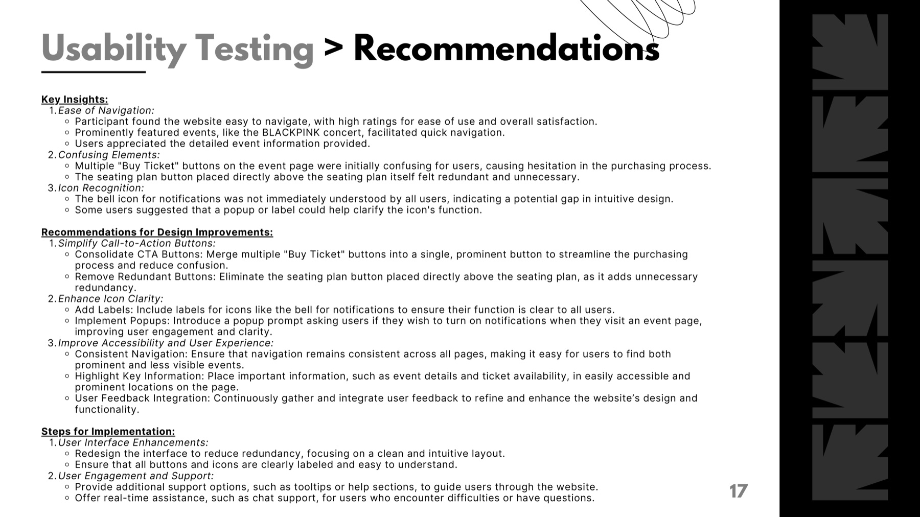
- Consolidate repeated ticket CTAs into one prominent action.
- Remove redundant controls.
- Pair unfamiliar icons with labels or explanatory prompts.
- Introduce a notification prompt on event pages.
- Keep navigation patterns consistent across the experience.
- Continue testing with a broader set of visitor journeys.
Outcomes and impact
The project produced a researched, high-fidelity concept for a more focused Sports Hub experience and demonstrated how interface evaluation could be carried through into prototyping and task-based usability testing.
This was an academic project. The redesign was not launched, and no real-world performance or conversion outcomes are claimed.
Reflection
The project taught me that reducing friction is not always about removing information. For a destination with many audiences, the more important task is deciding what should be prominent, what should be grouped and what should appear only when it becomes relevant. Testing also showed that familiar-looking icons and repeated CTAs can still create uncertainty when their purpose is not explicit.
What I would do next
- Test with users representing different audience groups
- Evaluate mobile event-discovery journeys
- Test accessibility with keyboard and screen-reader users
- Measure event-detail views, ticket-click-through and notification activation
- Re-run the test with a recorded, representative sample so results can be compared across audience groups
- Develop a more systematic design system